
Start with the job and where it will be worn
Before you settle on colours, think about the purpose of the item. A school sports shirt needs strong contrast and easy reordering, while a staff shirt for a warehouse or outdoor team may need darker cloth that hides day to day marks better. For coastal areas like Durban and Amanzimtoti, lighter garments can feel cooler in the heat, but they also show stains sooner.
Ask who will wear it, how often it will be washed, and whether it must match an existing uniform exactly. If the order is for an event in Pietermaritzburg or a club on the South Coast, consider how the colour will read in bright sun and under indoor lighting too.
- Daily wear: choose colours that hide wear and washing fade better.
- Event wear: choose bold contrast so the message stands out from a distance.
- Uniforms: check existing shirt samples, not just a photo on a screen.
- Outdoor use: avoid colour combinations that disappear in glare or strong sun.
Use contrast to make print readable
Good contrast is what makes text, logos and numbers readable. Dark ink on a pale shirt usually prints clearly. Light ink on a dark shirt can work well too, but the artwork must be prepared properly and the garment colour should not fight with the ink. A navy shirt with black print, for example, will often lose detail.
We check whether the garment and ink pair are strong enough for the design before production starts. For fine lines, small lettering and school crests, contrast matters even more. If the colours are too close, the print can look muddy once it is cured and washed.
- Best for readability: white on navy, black on white, yellow on royal blue.
- Risky pairings: red on black, dark green on navy, grey on charcoal.
- Small text: use the highest contrast available, not just the colour that looks stylish.
- Line art: keep backgrounds simple so details do not blur into the garment.
Match ink colour to fabric type and finish
Not every garment takes colour the same way. Cotton T-shirts, polyester sportswear, caps and workwear all behave differently. Some fabrics have a matt finish, others reflect more light, and that changes how the ink colour appears once printed. A colour that looks clean on a cotton tee may appear a touch softer on textured fabric or a cap front panel.
For dark garments, we usually check whether the ink needs an underbase or another print method to hold the colour properly. On lighter cloth, colour is often more straightforward, but the final result still depends on the fabric weave, stretch and coating. Screen making and artwork preparation help keep the colour stable from run to run.
- Cotton: gives a steady print surface for everyday colour work.
- Polyester: needs careful setup so colours stay clean and do not shift.
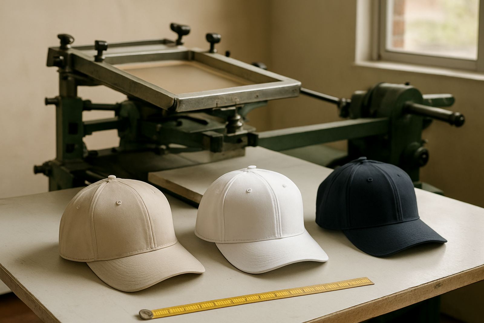
- Caps: curved panels can change how the colour reads from different angles.
- High stretch items: keep artwork simple so the print does not distort.
Think about branding, not just preference
Many customers come in with a favourite colour in mind, but branding should guide the choice. School colours, club colours and company identity need to be consistent across shirts, caps, banners and signage. If the same logo must appear on multiple items, choose a colour set that works across all of them, not only one garment type.
It helps to have a clear standard for the main colour, the secondary colour and the accent colour. That way your order can be repeated later without guesswork. For Durban businesses and KZN schools that reorder through the year, consistency saves time and avoids mismatched batches.
- Main colour: the colour people recognise first.
- Secondary colour: supports the design without overpowering it.
- Accent colour: use sparingly for detail, borders or highlights.
- Reorder check: keep one approved sample for future jobs.
Review samples under real light before you approve
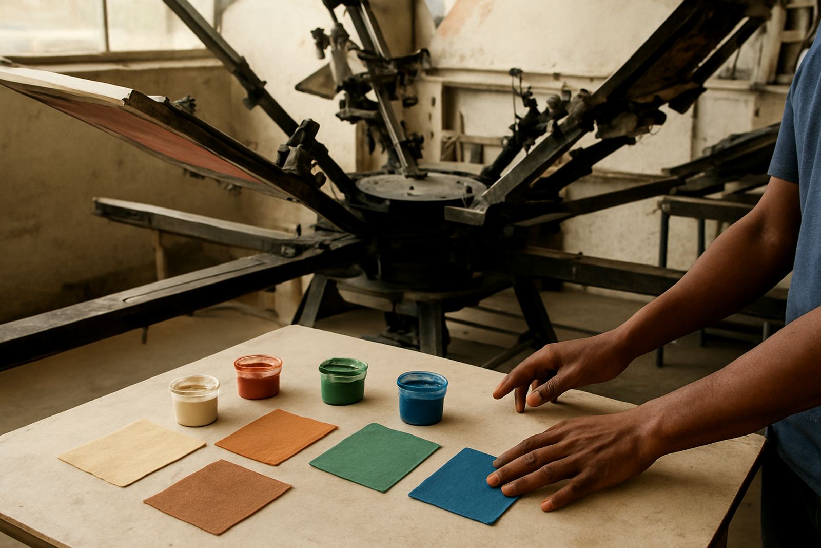
A colour can look very different in an office, in the workshop and outside in the sun. Before approval, compare the garment and ink under the light where it will mostly be seen. This is important for signage and uniforms, and especially for orders headed to schools, clubs and event teams in KwaZulu-Natal. A colour that seems bright indoors may read duller outdoors, or the other way round.
If there is time, check a sample on the actual garment rather than only on paper. Ink can change slightly once it is cured and cooled, so a real test matters. We also check registration and test print results before moving into the full run so the final colour stays predictable.
- View samples in daylight, under indoor lights and at a distance.
- Check the actual garment size, not only a smaller mock-up.
- Make sure the final colour works with washing and regular use.
- Keep your approval note with the job details for later reorders.
Practical checklist before production starts
Once you have the colours sorted, a short checklist helps avoid delays. It is easy to focus on the logo and forget the shirt colour, cap base, or banner background. A clear brief also helps the artwork team prepare separations and film output correctly, which matters when the order includes multiple sizes or mixed garment colours.
Our team in Umbilo handles artwork checking, colour separation, screen preparation and production planning in house, so the colour choice can be matched to the print method from the start. That saves time on corrections and keeps the order moving, even when load-shedding or courier schedules complicate the day.
- Confirm garment colour and size range.
- Confirm ink colour and any alternate option.
- Check whether the logo has small text or fine detail.
- Approve the sample on the correct fabric type.
- Keep the same colour reference for future repeat orders.