
Why dark garments need a different approach
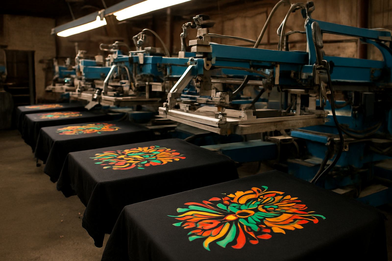
Printing on a black T-shirt is not the same as printing on white cotton. Dark fabric absorbs light, so thin lines, soft colours and low-contrast logos can disappear unless the print is planned properly from the start. That is why schools, clubs and businesses around Durban often ask for a test print before a full run, especially when the design has fine text or small details.
On dark garments, the print has to sit on top of the fabric with enough opacity to hold its shape. If the artwork is not prepared for that, the result can look muddy, patchy or too dull once washed and worn a few times.
Artwork that stays sharp on black fabric
The best starting point is clean artwork. Vector files are ideal because they hold crisp edges at any size, and they make colour separation much easier for screen work. If a logo arrives as a small photo from WhatsApp, it may still be usable but it usually needs redrawing before it can print well on a dark shirt.
- Use bold lettering where possible, because thin fonts can fill in or break up.
- Keep important details away from tiny gradients and low-contrast shades.
- Ask for artwork checking before the run, especially if the garment colour is black, navy or maroon.
- For school events and club orders, make sure the same logo is used across all sizes so the print stays consistent.
Anele in production will often catch issues such as weak outlines, poor spacing or colours that will disappear on dark cloth, which saves time later and avoids wasted shirts.
Ink and underbase choices that make a real difference
For dark garments, the main challenge is getting the colour to show clearly. A white underbase is often used to lift the top colour so it sits bright on the fabric instead of sinking into it. That is especially useful for red, yellow, light blue and other colours that can look flat on black or navy garments.
At the same time, too much ink can make the print feel heavy and stiff. The aim is to balance coverage with comfort, especially for staff uniforms and school wear that must be worn all day in Durban heat and humidity. A good print should stay readable without turning the shirt into a board.
- White underbase for strong colour on black or deep shades.
- Opaque inks for logos that must stand out in daylight.
- Controlled ink deposits so the print stays flexible after washing.
- Careful curing so the print does not crack or wash out early.
Screen setup for clean, repeatable results
Good screen making matters just as much as the ink. If the mesh, stencil and exposure are not right, the print may blur at the edges or break up in the small details. Our in-house stencil and screen making helps keep the process consistent, from frame reclaiming and emulsion coating through to exposure and washout.
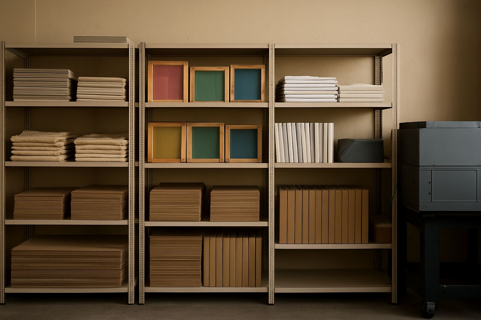
For repeat orders, screen registration has to be exact. If a club orders 30 black tees now and another 60 next month, the logo should sit in the same place and the colours should match as closely as possible. Screen storage also helps with this because it keeps approved screens ready for later runs.
What works best for Durban schools, clubs and businesses
Different customers need different levels of durability. School leavers, sports clubs and company uniforms all have their own use patterns, and that affects the print method. A one-off event shirt may need speed, while a staff uniform order needs stronger wash resistance and a neater finish.
For Umbilo and surrounding areas, we often see dark garments used for tuckshop staff, sports days, security teams, musicians and promotional events. In those cases, test printing is worth it because it shows how the design behaves on the actual cloth before the full job is released.
- Schools often need clear names, badges and year text on dark shirts.
- Clubs usually want bold front logos and number marks that are easy to read from a distance.
- Businesses may need dark uniforms that still carry bright branding without looking overprinted.
A local example from Umbilo to Pietermaritzburg
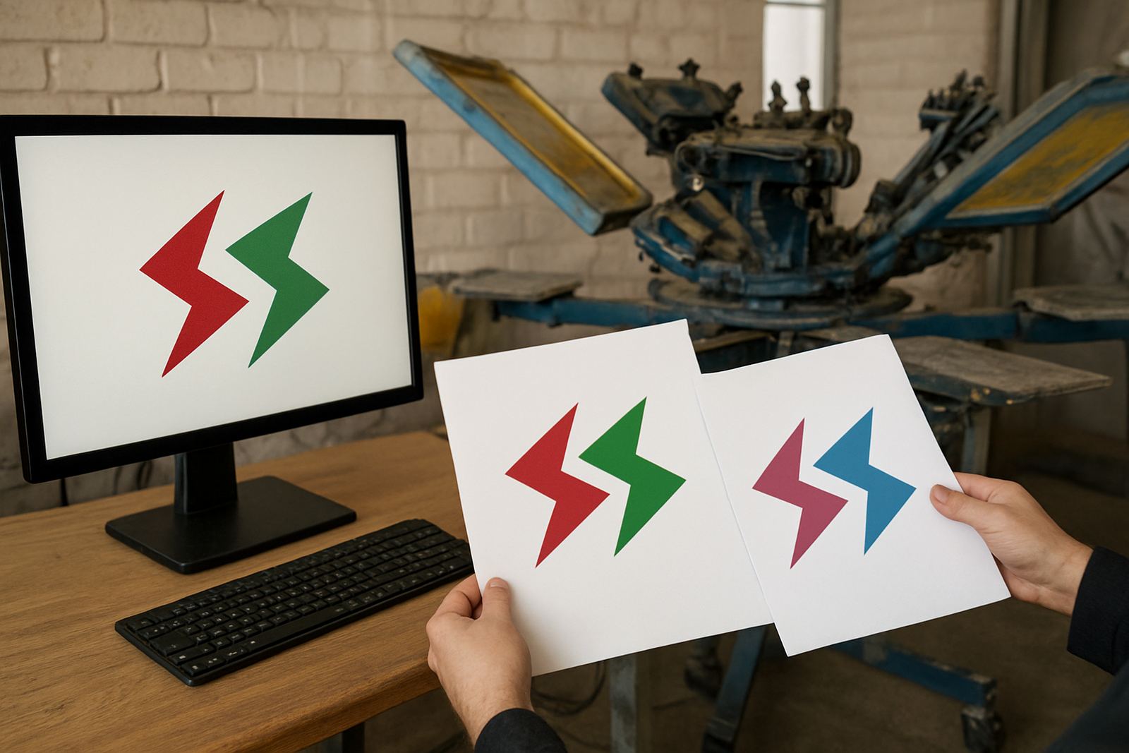
A Durban school once sent through a black T-shirt design for a sports event, but the original logo had thin yellow outlines and a fine script line. On screen it looked neat, yet on the shirt it would have disappeared in the neckline shadow and faded into the fabric. After artwork checking, the logo was redrawn with stronger lines, the colours were separated properly and a white underbase was added.
The result was a print that held up on the field and still looked clean after repeated washing. That kind of adjustment is common, because what works on a bright screen or computer file does not always work on dark cloth. With courier delivery available nationwide, the same process works for KZN orders from Pinetown, Westville, Ballito and Pietermaritzburg too.
How to get dark garment printing right first time
If you want dark shirts to look sharp, start with the fabric colour, not just the logo. Decide where the print will sit, how bold it needs to be and whether the design needs a white base or a stronger redraw. That saves time and avoids disappointment when the order arrives.
At Screen Spectrum in Umbilo, we handle artwork checking, colour separation, film output, screen stretching, test printing and full production in-house, so the job stays under one roof from the first file to the final garment. For black and deep-coloured shirts, that control makes a practical difference you can see and feel.