
Why hand feel matters on everyday wear
Hand feel is the first thing people notice when they run a hand across a printed shirt. If the print sits too heavily on the cloth, the garment can feel stiff, warm and less comfortable for long school days, staff uniforms or event wear. A softer finish usually means better wearability, though the right choice still depends on the garment, the artwork and how many pieces you need.
At Screen Spectrum in Umbilo, we often help customers decide what should feel light and what can carry a bolder print. A club tee for weekend use may handle a firmer finish, while a hospitality shirt or school event top often needs a smoother feel that does not crack after a few washes.
- Thinner prints usually feel lighter on the body
- Heavier ink coverage can suit logos that need strong visibility
- Fabric texture changes how smooth or raised the print feels
How fabric type changes the final touch
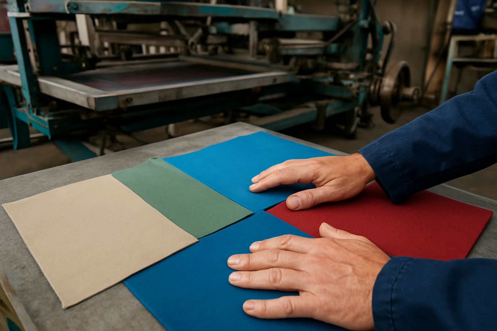
Cotton, polyester and blend fabrics all behave differently under ink. Cotton usually gives a softer print surface and absorbs ink well, which is why it is popular for T-shirts and promotional wear. Polyester can be slicker and needs more careful handling because heat and ink behaviour matter more. Blends sit somewhere in between and often give a practical balance for uniforms used in Durban and inland towns alike.
Local climate also plays a part. In humid areas like Umbilo, Berea and Durban Central, some fabrics hold moisture and can feel warmer against the skin after printing. For schools in Pietermaritzburg or teams travelling through KZN, choosing a breathable fabric can make a bigger difference than people expect.
- Cotton: usually softer to wear and easier for many print styles
- Polyester: useful for sportswear, but needs the correct print approach
- Blends: often chosen for everyday uniforms and repeat washing
Screen print, digital print and how each feels
Screen printing normally leaves a more visible layer of ink on the fabric, so the feel can range from soft to quite noticeable depending on the ink deposit and design size. Large solid blocks will feel different from small chest logos. Digital print can feel lighter in some cases, particularly on detailed artwork or smaller runs, because the ink sits differently on the garment.
Neither method is automatically better. It depends on the fabric, the number of colours, the size of the print and how the shirt will be used. For example, a school fundraiser in Westville with a simple one or two colour logo may suit screen printing well, while a detailed event design for a Ballito delivery order may work better through a digital route. The aim is to get the right balance of appearance, comfort and wash durability.
- Large solid prints usually feel firmer on the shirt
- Fine artwork can feel lighter when printed correctly
- Short runs and varied artwork often need different handling than bulk orders
Artwork size, ink coverage and the weight on the garment
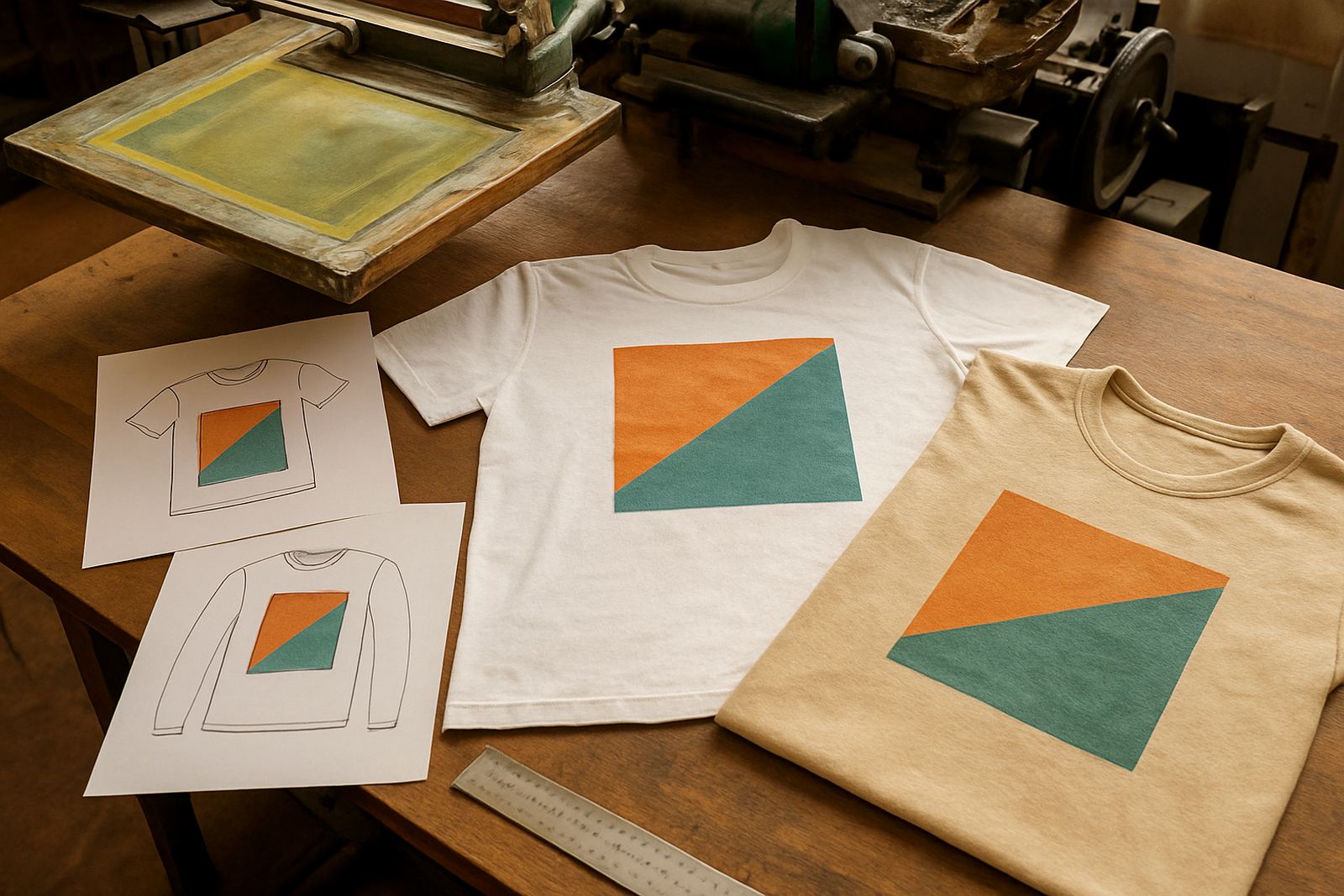
Many customers focus on colour first and forget that size changes feel just as much. A small left chest logo barely alters the garment, but a full front print can change how the shirt bends and breathes. Thick lines, heavy fills and dense artwork all add to the surface feel, while open artwork with spacing can sit more lightly.
That is why artwork checking matters before a run starts. At Screen Spectrum, our team can look at the file, check the line weight, and decide whether vector redrawing or colour separation will improve the print. Priya Naidoo coordinates artwork so the final job suits the garment, and Yusuf Khan handles the screen making side so the stencil matches the design properly. It saves time and helps avoid a print that feels too heavy or looks patchy.
- Small logos generally give a softer feel
- Dense artwork can make the shirt less flexible
- Good file prep helps control both appearance and touch
Garment use in KZN shapes the print choice
A shirt worn once at a marketing event does not need the same finish as a school shirt worn every week. In Durban, where heat, humidity and quick turnarounds are part of normal life, the intended use matters. Sports clubs may want a print that holds up to sweat and frequent washing, while businesses often want uniforms that stay neat through a long shift and still feel comfortable by lunchtime.
We see this with orders from Umbilo, Pinetown and Amanzimtoti. A restaurant team may choose a lighter print on breathable fabric because staff move around all day. A club ordering for a tournament may prefer a stronger print for visibility from the sideline. The same artwork can be adjusted in size, placement and ink coverage to suit the job instead of forcing one print style onto every garment.
- Staff uniforms often need comfort over a full shift
- Club wear may need stronger logo visibility
- School orders should balance durability and comfort for repeated use
What happens before the print reaches the shirt
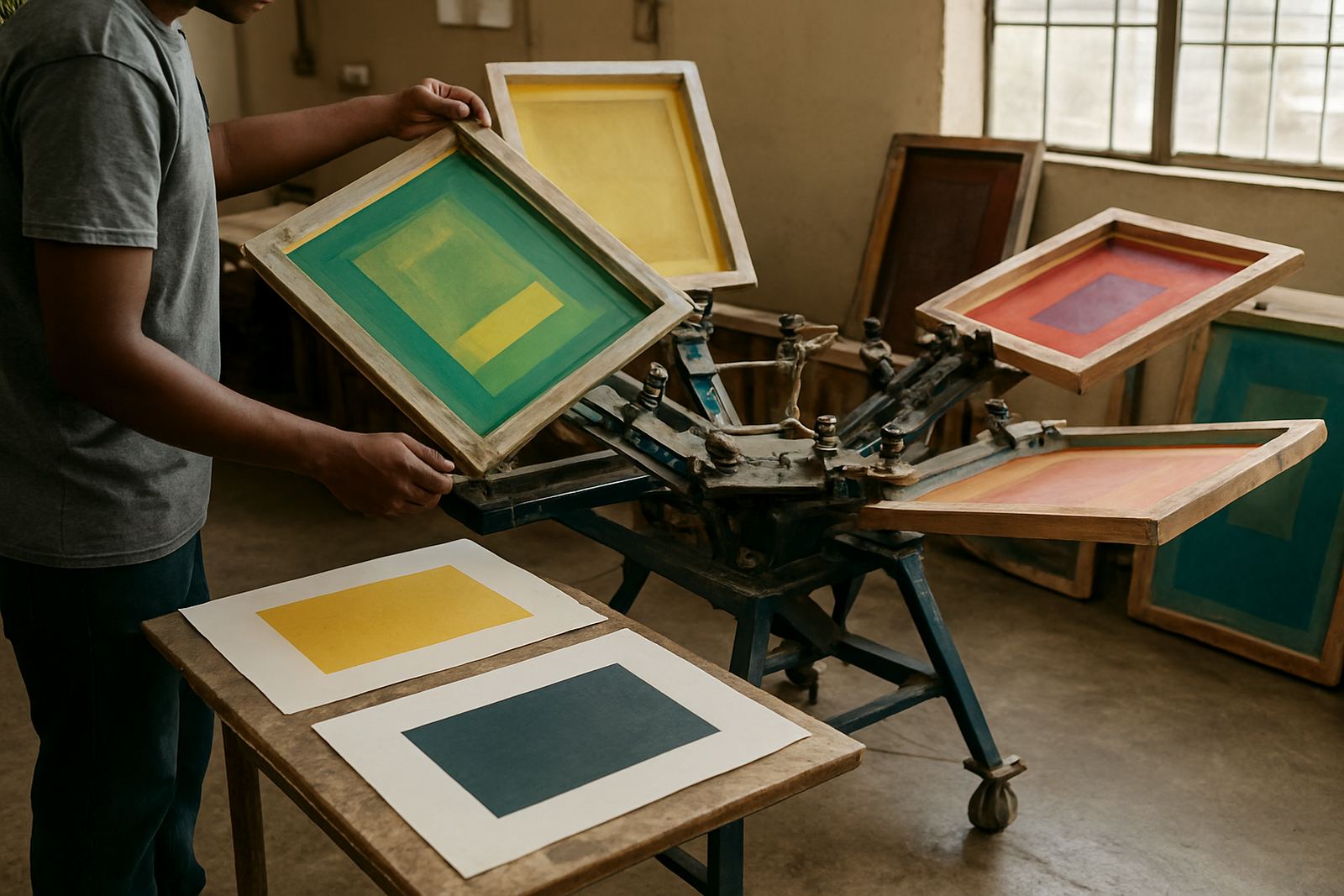
Hand feel is influenced long before the garment reaches the press. Screens must be stretched properly, coated evenly with emulsion, exposed cleanly and washed out without rough edges. If the stencil is uneven, the print can come out blotchy or too thick in places. That extra thickness is what often creates an unwanted heavy feel on the fabric.
Good screen registration and test printing also matter. A test run shows whether the artwork needs adjustment before the full batch starts. Screen storage and reclaiming help keep things clean between jobs, which is important when running different colours and garment types in the same week. In practical terms, it means fewer surprises and a cleaner finish on the shirt itself.
For customers ordering from Durban Central, Berea or further afield, this prep work is one reason the final garment feels right instead of just looking right.
Choosing the finish that suits the job
If you want a softer hand feel, start by thinking about fabric, print area and the real purpose of the garment. Keep the artwork smart and simple where possible, and do not overload a lightweight shirt with a print that is too large for the fabric. If the job is for a school, a club or a business in KZN, the best result usually comes from matching the print style to the way the garment will be worn and washed.
Screen Spectrum in Umbilo works with local and nationwide orders, with courier delivery across South Africa. Whether the job is for a handful of shirts or a larger run, the same practical checks apply: right garment, right artwork, right print method and the right amount of ink on the cloth. That is what gives you a finished piece that feels good in the hand and on the body, not just on the hanger.
- Match the print size to the garment use
- Choose fabric with the climate and wash routine in mind
- Check artwork and print method before the run starts