Why shirt colour matters before artwork is even approved
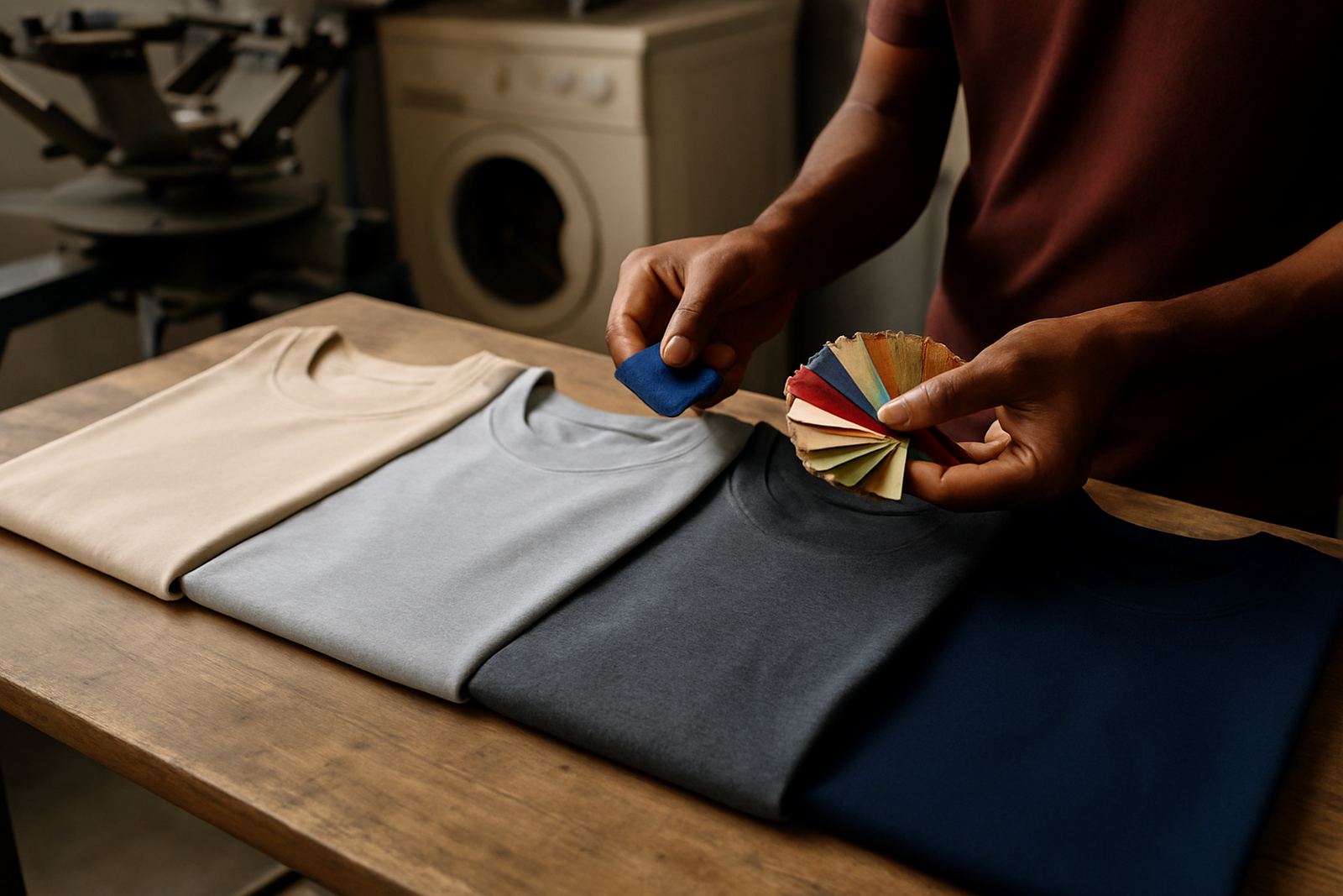
Many people choose the shirt first and only then think about the print, but the fabric shade has a direct effect on the final job. Light garments usually give stronger contrast for dark artwork, while dark garments need more careful ink selection and better coverage. That is why we check artwork and talk through garment colour before we make screens or start digital printing.
In Durban, where humidity can affect drying times and coastal air can be hard on stored stock, planning the colour properly helps keep production moving. If the shirt and print are matched well from the start, there is less trial and error, fewer reprints and a cleaner finish for the customer.
High contrast shades that keep logos easy to read
If the main goal is clear branding, choose a shirt colour that lets the logo stand out at a glance. White, black, navy, maroon and royal blue are common choices because they give good contrast with many corporate and school designs. The best option depends on your logo colours, the size of the print, and whether the artwork includes fine detail or small text.
- White shirts suit dark logos, simple club marks and event wear.
- Navy and black work well for bright artwork, especially on workwear and sportswear.
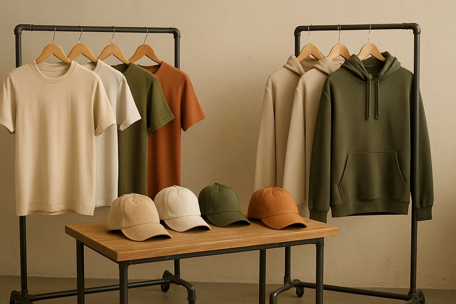
- Grey and sand tones are useful when you want a softer, everyday look.
- Bright colours can work, but they need careful ink planning so the artwork does not disappear into the fabric.
For small chest prints, the contrast matters even more. A detailed logo on a red shirt may look fine from a distance but become hard to read up close if the ink colour is too close to the garment shade.
How fabric colour affects ink opacity and print method
Screen printing and digital printing do not behave exactly the same way on every shirt colour. On dark garments, light inks often need stronger opacity so the print sits proudly on the fabric instead of fading into it. On light garments, the same artwork can usually be produced with fewer passes and a softer hand feel. That affects cost, turnaround and the final appearance.
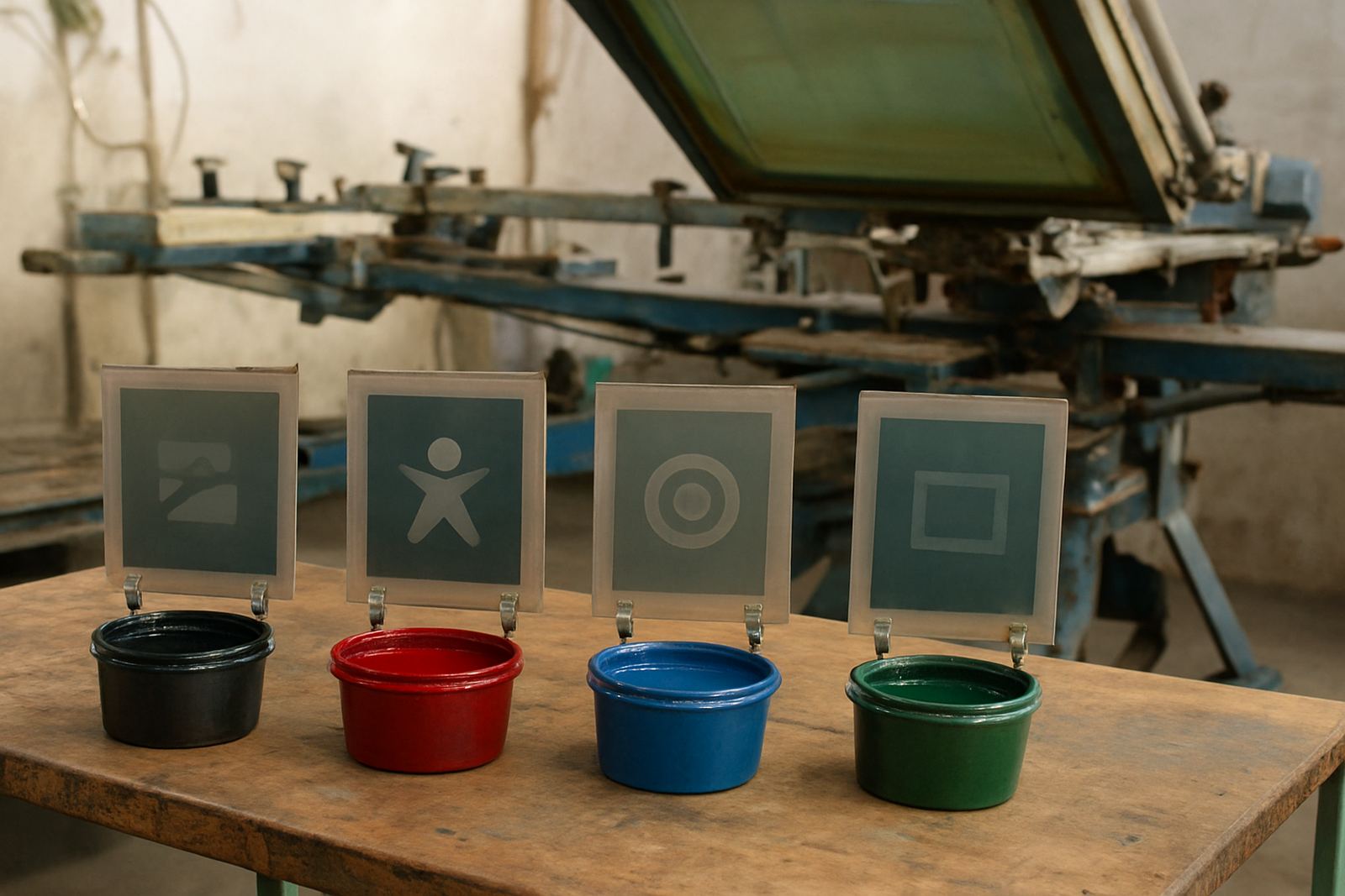
When we prepare a job in Umbilo, we consider the cloth colour before we do colour separation, film output and screen exposure. For larger runs, the screen making stage matters a lot because a cleaner stencil gives more even coverage and better registration. For smaller jobs or multi-colour artwork, the shirt shade can decide whether a design is practical or whether it needs simplifying.
- Dark garments often need stronger ink layers for solid coverage.
- Very bright shirts can shift how certain colours look once printed.
- Textured fabric may need a bolder design to stay readable.
- Soft cotton and polycotton can take ink differently, so test printing is worthwhile.
Choosing colours for schools, clubs and business uniforms
Different clients need different results. Schools often want colours that hide wear, show house identity and stay neat through frequent washing. Sports clubs usually want something energetic and easy to spot on the field. Businesses often need a shirt colour that looks professional at the counter, on site or during deliveries. The right base colour depends on what people are doing in the shirt, not only how it looks on a hanger.
For a Pietermaritzburg school order, for example, a navy or white shirt can be a better choice than a pale pastel because the print stays visible and the garments hold up better through repeated use. For a coastal Durban team, darker shades can be helpful because they do not show grime as quickly, but the print must still be planned for strong contrast. We also keep screen storage and frame reclaiming in mind so repeat orders can be matched properly later on.
What works best for events, promotions and short runs
Event shirts are often ordered fast, and the colour choice should support the message rather than fight it. If the event is one day only, a bold shirt colour can help make the group visible, but the print still needs enough contrast for photos and crowd recognition. For promotional give-aways, a neutral shirt is often safer because it suits more people and works with a wider range of logos.
When the run is small, the temptation is to pick an unusual garment shade for the sake of variety. That can work, but it must be balanced against print clarity and stock availability. We regularly handle courier delivery nationwide, so it helps to choose colours that can be sourced consistently for repeat orders or branch rollouts across KZN and beyond.
- Use white or natural tones for the widest design flexibility.
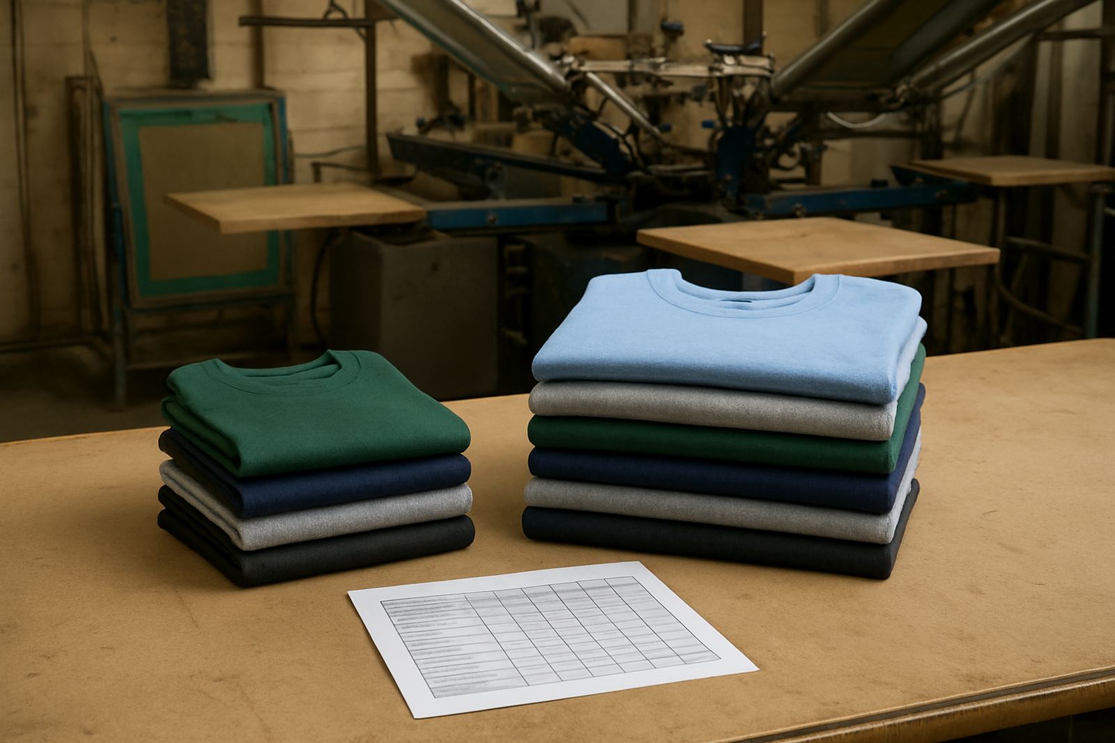
- Choose navy, black or grey for a more formal business feel.
- Pick one accent colour only if the logo is simple and bold.
- Ask for a test print when the garment colour is unusual or very bright.
A Durban example: matching shirt colour to real conditions
A local club in Durban Central may want shirts for weekend events, with members moving between outdoor areas, transport and venue halls. In that setting, a mid to dark shirt colour can make sense because it hides marks better and keeps the logo readable in different light. If the club chooses a very pale garment, the print may look clean at first but it can show stains quickly and may need a second colour pass to keep the logo sharp.
That is why we speak to clients from Berea, Pinetown, Westville, Amanzimtoti and Ballito about the use case, not just the art file. A shirt for staff in an air-conditioned office, a garment for outdoor fund-raising, and a shirt for school sports day all need different thinking. Colour choice should support the people wearing it, the washing it will face and the image the organisation wants to project.
A simple way to decide on the right shirt colour
If you are unsure where to start, look at three things: how much contrast the logo needs, how often the shirt will be worn, and what impression the garment should give. From there, the best colour usually becomes clearer. We can check your artwork, redraw vector files where needed, separate colours, and advise on the shirt shade before production starts. That keeps the print process practical and helps avoid avoidable mistakes.
For many KZN schools, clubs and businesses, the best choice is not the flashiest colour, but the one that keeps the branding readable, durable and suited to daily use. A well chosen shirt colour gives the print a stronger base, and that shows every time it is worn.