
Why white and pastel garments print more cleanly
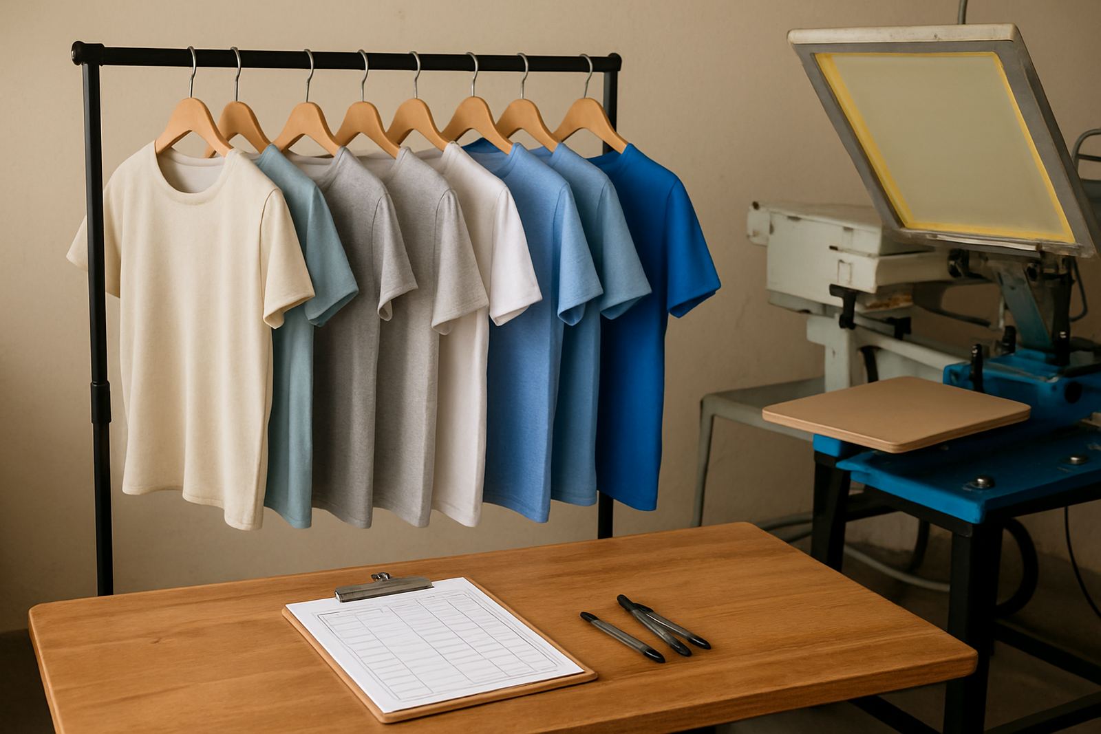
Light garments are easier to print on because the fabric colour does not fight the ink. White, cream, sky blue, pale grey and other pastel shades let logos, names and event artwork show up with less underbase work, which can reduce setup time and keep the finished print softer to wear. That matters when you are ordering shirts for a school fun run in Durban North, a club event in Pinetown, or staff wear for a business in Umbilo.
On light fabric, the artwork can usually be kept truer to the original design. Fine lines, small text and bright colours are easier to read, and the garment often keeps a lighter hand feel. For many customers this is the best option when they want a neat result without a heavy print sitting on the shirt.
- Works well for logos with small lettering
- Better for bright colours and clean edges
- Good choice for school events, promotions and uniforms
- Less ink coverage means a softer finish on the garment
Choosing the right print method for the job
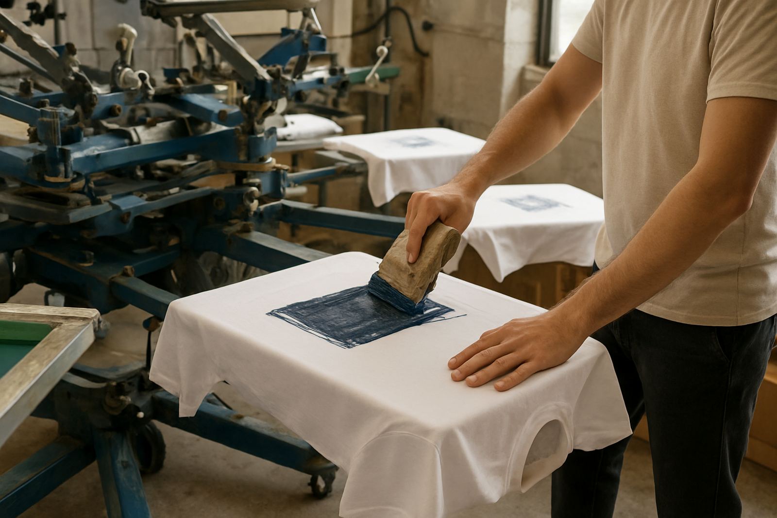
Not every light garment order needs the same setup. The best method depends on the artwork, the number of pieces and the fabric type. A simple one-colour logo for a sports day may suit screen printing, while a full-colour design for a once-off event shirt may be better handled with digital print. If you are working with caps, banners or mixed items in one order, it helps to plan the production around the garment and the use.
At Screen Spectrum we check artwork first, then advise on colour separation, film output and screen making where needed. That keeps the job practical from the start. For light garments especially, a clean file can save time and avoid patchy edges or muddied colours once the ink is down.
- Screen printing suits repeat jobs and bold logos
- Digital print is useful for detailed, full-colour artwork
- Vector redraws help when supplied files are too small or blurry
- Test printing can confirm size, colour and placement before full run
Artwork that works best on pale fabric
Because the base colour is light, your artwork has more room to breathe. That said, some designs still need a bit of adjustment before printing. Thin fonts can disappear if they are too small, and pale ink colours can get lost on a cream or pastel shirt. A good layout keeps contrast strong enough for the garment to carry the message clearly.
We often see school and club artwork that comes in as a low-resolution image sent over a phone. That can print poorly if it is not checked first. Clean vector art gives sharper results, especially on light garments where the detail is obvious. If there are multiple colours, we handle separation carefully so each layer sits where it should and the final print stays tidy.
- Use bold font weights for names and numbers
- Keep key text large enough to read at arm’s length
- Avoid very pale inks on cream or pastel fabric
- Prepare artwork at the correct size from the start
What to expect from the garment and the ink
Light garments are not all the same. A white cotton T-shirt behaves differently from a pale polyester top or a blended fabric used for school sport. The weave, stretch and absorbency can all affect how the print settles. Some fabrics take ink very well, while others need a more careful approach to avoid smudging, cracking or uneven coverage.
Durban’s coastal humidity can also affect drying times and handling, especially on larger runs. If the pieces are packed too soon, the print can mark or stick. That is why screen exposure, washout, touch-up and proper screen storage all matter in production. With the right setup, the final result stays crisp even in warm weather and mixed loads.
- White cotton is usually straightforward to print on
- Pastel polyester may need careful handling and test prints
- Higher humidity can slow drying between stages
- Garment texture affects how fine detail appears
Practical order tips for schools, clubs and business wear
When you are ordering light garments for a team or event, a bit of planning goes a long way. It helps to decide on sizes, print positions and how many colours are needed before production starts. That is especially useful for schools in KZN where different grades or teams may need separate naming or numbering on the same base shirt.
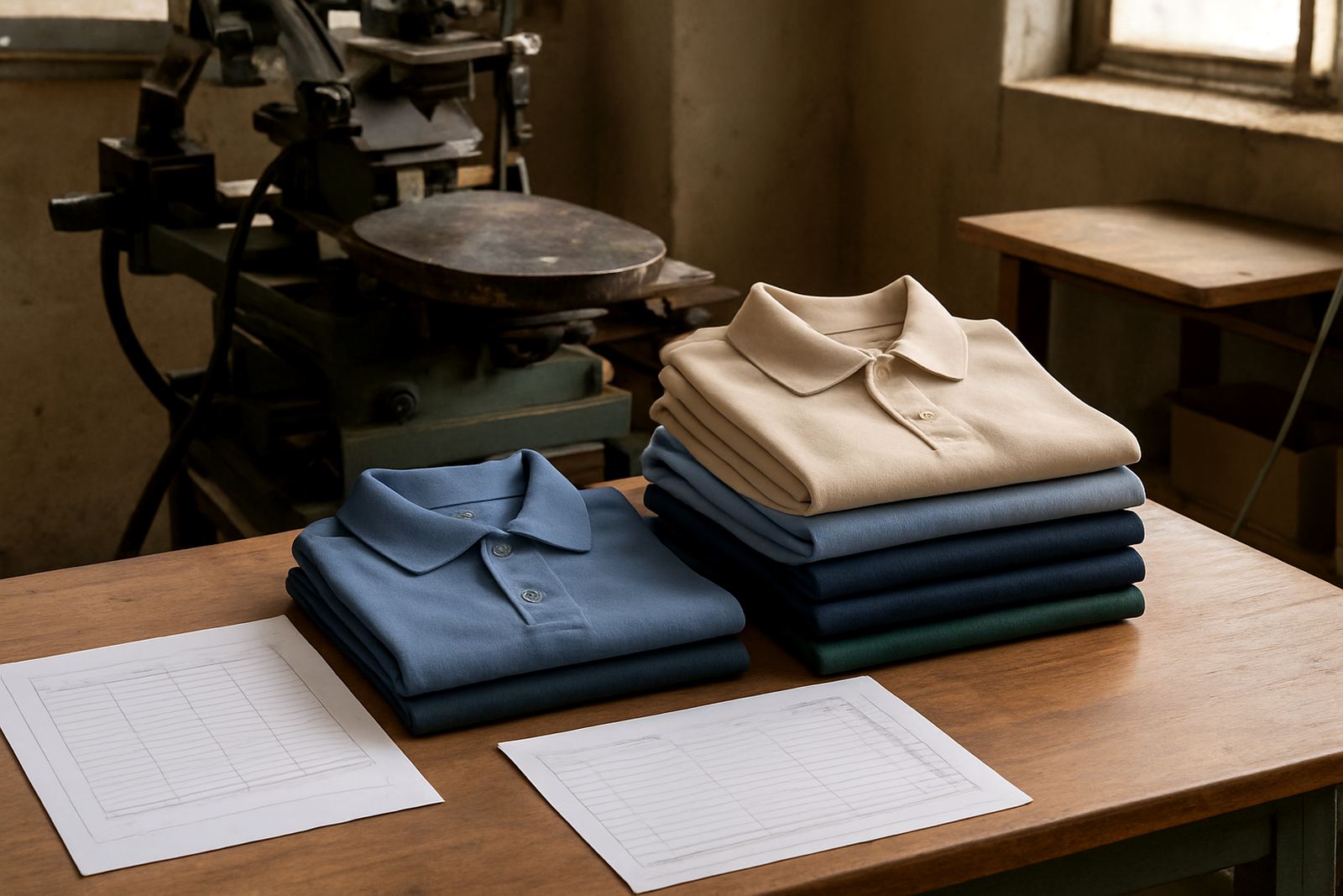
For businesses, light garments are often a smart choice for summer uniforms, promotions and trade day wear. They are cooler to wear and usually easier to match with a clean printed logo. If you are sending work to Umbilo from Berea, Westville or Durban Central, it also helps to confirm the delivery details early so the finished items reach the right site without delay.
- Confirm sizes before artwork is finalised
- Decide whether names, numbers or positions change per garment
- Allow time for proofing on first-time jobs
- Plan for courier delivery if your team is outside Durban
A Durban example: light shirts for a school open day
A school in Pietermaritzburg may want 120 light blue shirts for an open day, with a simple crest on the chest and sponsor wording on the back. On that kind of order, the lighter base keeps the design easy to read and helps the print feel less heavy in warm weather. The job can be organised with artwork checking first, then screen stretching, emulsion coating and exposure before test printing begins.
Once the sample is approved, the full run can move through production and dispatch without fuss. For KZN schools and clubs, that kind of setup is practical because it balances neat presentation with cost control. If the same order needed caps or banners as well, those can be planned alongside the shirts so the whole set matches.
That is the main benefit of printing on light garments. The process is simpler, the artwork options are wider, and the end result is usually cleaner for everyday wear. When the base garment is chosen well and the artwork is prepared properly, the print does not have to work as hard to be seen.