
Why print position matters before artwork is approved
Most people think first about the logo, but placement is just as important. A clean design in the wrong spot can feel crowded, sit awkwardly on the body or lose impact when the wearer is moving. The position also affects how many print colours can be used, how much surface area is available and whether the item will stay comfortable for all day wear.
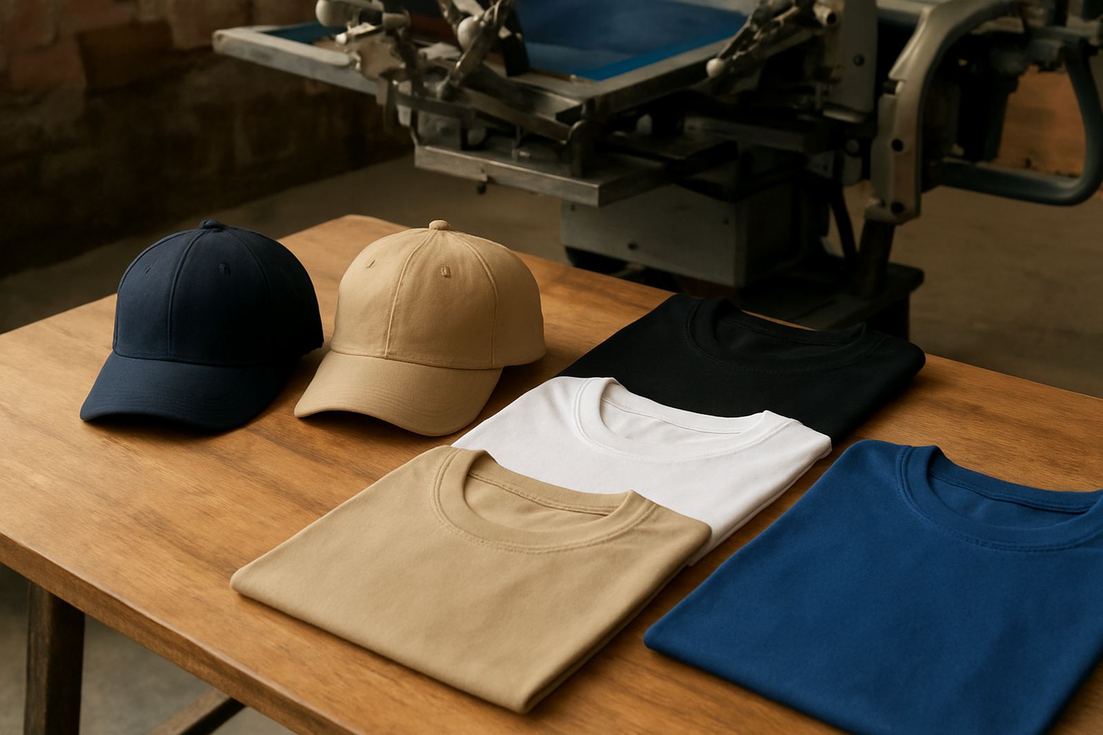
For example, a small left chest print works well on a collar shirt, while a large back print is better on a event tee or staff shirt that needs to be seen from a distance. On caps, the front panel is usually the main space, while sleeves and side placements are better for secondary text, a number or a small sponsor mark.
We check the artwork before production so the chosen position matches the garment shape. That includes artwork checking, vector redrawing if needed and colour separation for screen printing. If the print will be stretched across a seam, zip or pocket line, we will flag it early so you do not end up with a logo that looks half hidden once the garment is worn.
Front placement for clean branding and everyday wear
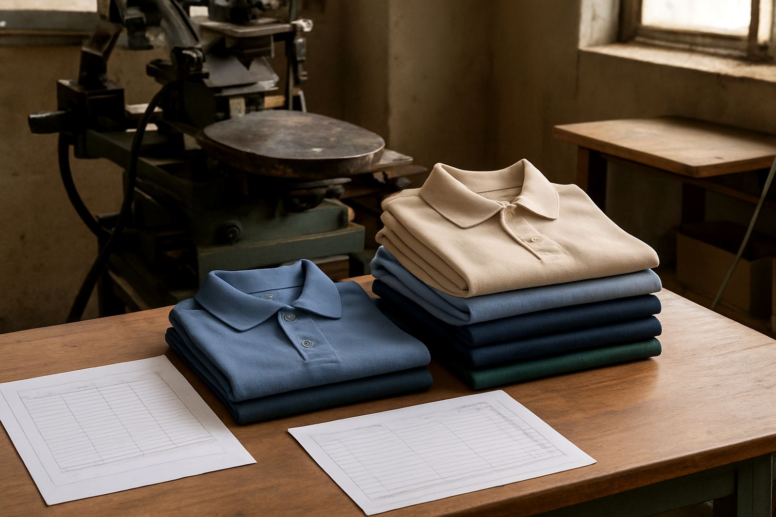
Front prints are the most common choice because they are easy to see and simple to wear. They suit school shirts, golf shirts, crew tees, staff uniforms and promotional clothing. A front placement can be centred, placed high on the chest or set off to one side depending on the design and the garment cut.
There are a few practical front options:
- Centre chest for bold brand names, campaign messages or team names
- Left chest for corporate wear, school wear and subtle branding
- Right chest for partner logos or role titles
- Lower front for fashion style prints or event merch
Left chest prints remain popular in Durban because they look neat and do not interfere with jackets, bibs or aprons worn over them. On lighter coloured shirts the print can be smaller and still stand out, while on dark garments a proper underbase or screen set-up helps the colour hold its shape. In humid coastal weather, proper curing matters too, because a rushed print can feel sticky and start cracking sooner than it should.
Back prints for visibility from across a field, hall or road
Back prints are ideal when the message needs to be seen from behind. This is common for sports teams, school tours, volunteer groups, security staff and business crews working on site. If people are moving in groups, a back print gives quick identification, which is useful at events, pickup points and busy municipal venues.
The back area is usually the largest print space on a shirt, so it allows more room for names, slogans, numbers or service details. A big back print also suits garments that are meant to be seen from a distance, such as event tees, staff uniforms and club shirts. If the garment has a hood, seam or panel line, the design may need to be adjusted so the text does not break in the wrong place.
Useful back print choices include:
- Shoulder level print for a logo or team name across the top
- Centre back print for larger text and graphics
- Lower back print for sponsor names or a website line
- Numbered back print for sports and club kits
For schools in KZN, especially when ordering for sports day or inter-house events, a clear back print can help teachers and parents spot children quickly. It also works well for clubs that travel between Durban, Pinetown and Pietermaritzburg, where the same shirt may need to serve both casual and formal settings.
Sleeve prints for detail, sponsors and smaller messages
Sleeve placements are useful when you want an extra message without crowding the front or back. They are often used for sponsor logos, year marks, department names or short slogans. On long sleeve garments, the print can run along the upper arm. On short sleeves, the space is smaller, so the design must be kept simple and legible.
Sleeve prints are a good option when the main artwork already takes up the chest or back. They also suit workwear where a company wants one large brand on the front and a second line of information on the sleeve, such as a branch name or safety message. For caps and some sportswear, the sleeve position can be swapped for a side panel print or a small side mark.
Because the sleeve area moves a lot, the print must be placed carefully so it does not twist when the wearer lifts an arm. That is one reason we do test printing before a full run when the layout is new. It helps us check the size, alignment and spacing on the actual garment, not just on screen.
Choosing the right position for the garment type
Not every print position suits every item. A T-shirt gives you more freedom than a fitted golf shirt. A cap needs a different layout to a hoodie. Work shirts with pockets, reflective tape or buttons also need planning so the print does not clash with the garment features.
As a rule, we look at the following before recommending a placement:
- Garment shape and whether it has seams, pockets or zips
- Print size and how far it must be seen
- Wearer comfort if the item will be used daily
- Number of colours in the artwork and the print method required
- Run size whether it is a one-off or a larger batch
For example, a club tee for a weekend netball event may work best with a front logo and a full back number. A corporate shirt for client visits may need a left chest mark only, so it stays neat under a blazer. A cap for a delivery team might carry a small front logo and a tiny side print for branch identification. This kind of planning saves reprints and helps the finished item look intentional rather than crowded.
How we handle print positions for Durban and KZN orders
Our production team in Umbilo works with schools, clubs and businesses across Durban and KZN, from Berea and Westville to Amanzimtoti, Ballito and Pietermaritzburg. Orders come in through the enquiry form, and we then check the artwork, confirm the placement and prepare the screens or digital setup needed for the job.
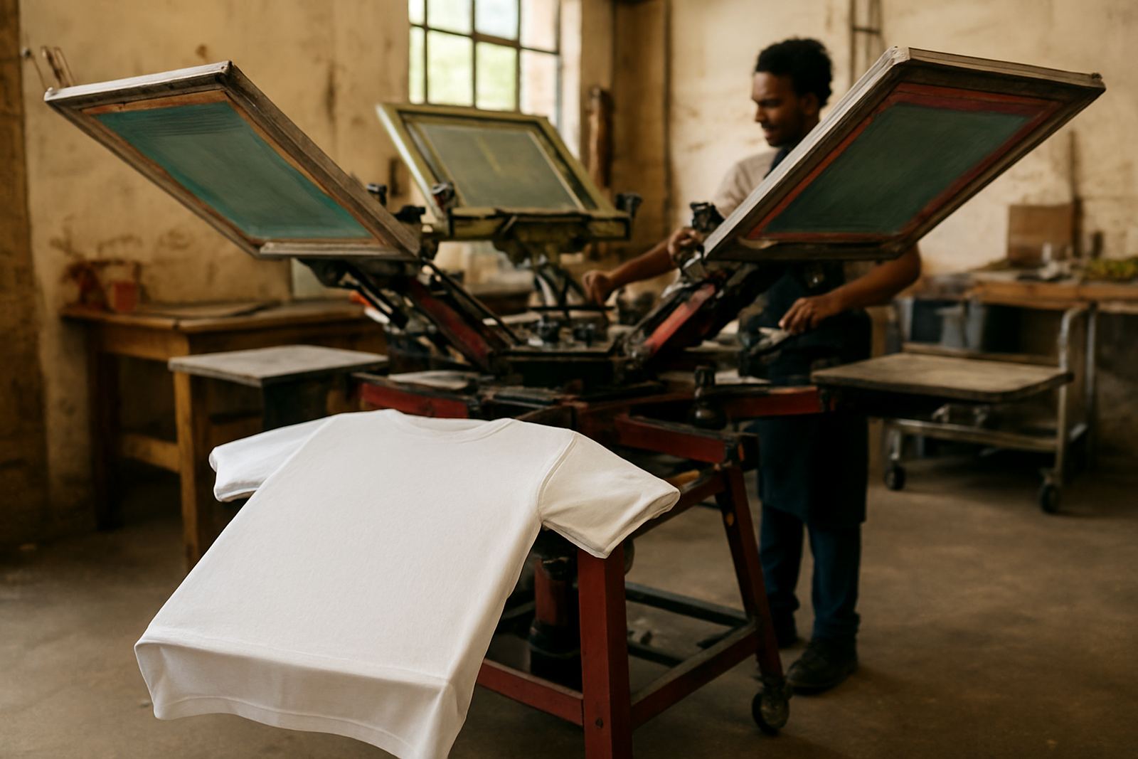
Because we make screens in-house, we can handle runs of any size and still keep the position accurate from the first item to the last. That matters for mixed orders, such as a school wanting front print on staff shirts, back print on learner shirts and sleeve print on event tees. It also helps when the same artwork must be adapted across different garments in one order.
We also keep screen storage and reclaiming organised so repeat orders can move faster. If a business in Durban Central needs the same placement for a re-order six months later, we can match the earlier setup more closely than if the job had to be rebuilt from scratch. That saves time, reduces waste and keeps the branding consistent.
A practical local example: school event shirts in Durban
A Durban school planning a winter fun run may need three different placements across one order. Staff shirts could use a small left chest logo for a neat look. Learner shirts might carry a larger front print so the event theme is easy to spot in photos. The back could hold a bold sponsor line or house name for visibility during the race.
That approach keeps the shirts useful after the event as well. Staff can still wear theirs for school duties, learners can use theirs for sports practice and sponsors get proper exposure without forcing one oversized design onto every garment. It is a simple example, but it shows why print position should be chosen with the full use of the item in mind, not just the first day it is worn.
If you are unsure where your print should go, send the artwork and garment details through the contact form. We will advise on the best front, back or sleeve placement for the item, and if needed we can suggest a smaller or cleaner layout that works better on the cloth you have chosen.